Statistical Modeling of Unemployment Levels During a Global Pandemic
Abstract
This report looks at unemployment levels for six different levels of formal education for individuals over the age of 25 for the past ten years. The Federal Reserve Bank of St. Louis had this particular data available on a monthly basis through March 1, 2020, which was around the starting point for current economic changes that have occurred because of the global pandemic. The data is used to create univariate models to simulate and predict what unemployment levels would have looked like if COVID-19 would have never occurred. I used various methods for determining whether certain aspects of the time series components were present, and also to determine if the models were accurate. Having accurate models allowed for better comparison between both the predicted and actual data. The results were more interesting than they were surprising and ultimately show that there was a noticeable increase from what would have been expected for most cases.
Introduction
The purpose of this report is to look at and forecast the unemployment levels for different groups within the population based on education. The data comes from the Federal Reserve Bank of St. Louis. Unemployment levels are already divided into different categories by the FRED. These categories include education and age, both of which I used for my analysis. The population I focus on includes individuals over the age of 25 from 6 different levels of education. These levels of formal education include people with less than a high school degree, high school degree, associate’s degree (or some college), bachelor’s degree, master’s degree, and doctoral degree. In the code, I refer to them as D0 for less than high school through D5 for doctoral degrees. I split the process into two phases to achieve my simulation and forecasting results. The first phase involved finding the models, which included both a seasonality and trend model, and an ARIMA model. The second phase involved simulating data, and predicting/forecasting what unemployment levels would have looked like from November through March. This report does spend more time on the simulation and forecasting portion, and the modeling is more of a means to an end. The observations I plan to highlight are the prediction that might have been expected prior to the introduction of the COVID-19 to the world. I go through this process to see if there were any differences between the groups, or if there were some consistencies in the results.
Modeling
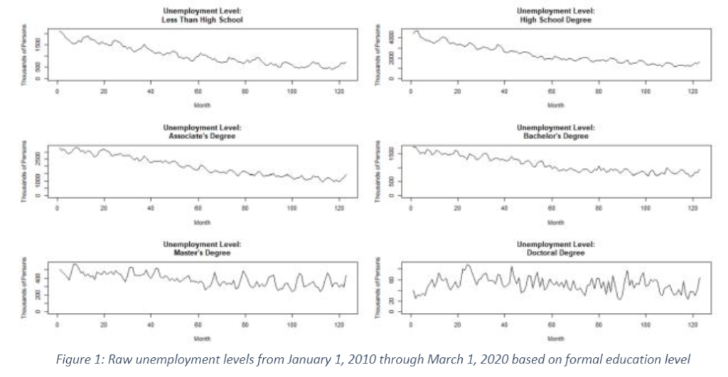
I focused on non-seasonally adjusted data for individuals 25 and over, and the data came with varying lengths of time for the different groups. To have some consistency in the data, I narrowed my attention onto the last ten years of unemployment levels starting on January 1, 2020 and ending on March 1, 2020. The raw data sets for all categories are shown in Figure 1.
From inspection, and from understanding the general differences highlighted by the media in employment from the great recession to our current point, I started with the assumption that all sets of data had a trend. I tested that assumption for each set of data and found that the stationarity requirement for the data was violated. From there, I found a downward sloping trend for all of the data sets. Next, the important part in the modeling process became finding any seasonal components present throughout the ten-year time period.

The periodograms from Figure 2 are all on the same scale to give some perspective on how dominant certain frequencies are for certain levels of education. The magnitude of certain frequencies are visually similar for individuals with less than a bachelor’s degree. The frequencies lose their magnitude for individuals with advanced degrees. However, that may be due to the number of individuals in those groups. Additionally, it is interesting to see that not all levels of formal education are impacted by the same seasonal components within the economy. We get a better understanding of similarities in seasonal components by adjusting the scales for each level of formal education as shown in Figure 3.

This closer look at the periodograms show the dominant frequency components in all data sets. Some of the common seasonality components for all the data occur around 0.01 Hz (8 years and a few months), 0.0833 Hz (1 year), and 0.166 Hz (6 months). Individuals with a doctoral degree show the most variation in dominant frequency components, but the frequency component with the largest magnitude still occurs around 0.166 Hz (6 months). I would not be surprised if the seasonally adjusted data from the Federal Reserve Bank has adjustments for the yearly and biyearly changes in employment. However, the low frequency component that occurs about every 8 years was a little surprising, and it is something I cannot currently explain, but it may relate to some external circumstance, besides typical business cycles, that occurred during the 10-year period that I observed. In terms of modeling, seasonality and trend models for each set of data were selected primarily on the AIC and BIC scores. The frequencies for the models were chosen after observing some of the frequencies with the largest magnitudes. A few variations with different periods were looked at and, again, the best model was chosen based on the AIC and BIC scores.
For each model, I went through the diagnostic plots to ensure the residuals were normally distributed with the QQ-plots and showed consistent variance throughout time through the residual vs fitted plot. Overall, none of the residuals appeared to have significant leverage in the cook’s distance plots. These diagnostic plots were particularly important for creating the ARIMA models that would assist for both simulations and forecasting.
For the ARIMA models, I took all the data sets through the same process of first comparing the AIC and BIC criteria for the residuals and also the first difference of the residuals coming from the seasonality and trend model. After looking at the BIC and AIC scores, I also took a look at the corresponding Ljung-Box statistic plots and looked for the all the points to be above the significance cut off line. If the AIC and BIC scores were within ten points of each other, I selected the ARIMA model with the better Ljung-Box statistic plots, more specifically the plots with the points further above the significance level where chosen. Ultimately, I only took the first difference for the residuals of the population with Master’s degrees. I used the auto ARIMA function to get any corresponding autoregressive (AR) and moving average (MA) terms because it provides reasonable results. The only exception came from the population with Associate Degrees, I was having difficulty getting any terms using the auto ARIMA function and the problem may have occurred because of the model was such a good fit for the data.
Simulations and Forecasting
All the simulations were done knowing that the trend could not continue indefinitely and lead to negative unemployment, but they were done assuming that the trends would persist for a few months leading into May. I ran simulations with the linear models to see what would have been the case had the trend and seasonality continued through May. The results of the simulations and the actual data are plotted side by side for each level of education in Figure 4.

Most sets of data, particularly for individuals with less than a Doctoral degree, there was an increase simulated through March. However, the simulations also showed decreases in unemployment levels towards the start of May, while the media has highlighted unemployment rates around this time. The simulated data for May cannot be compared to actual data because these results have not been posted by the Federal Reserve Bank. Yet, there appeared to be an increase towards March occurring in the real data, and people with less formal education saw an increase that occurred a few months prior to March. Time series analysis does not necessarily indicate what factors influence any increases, but there were probably factors other than COVID-19 that impacted people with Less than High School and High School Degrees. If we compare the simulated and actual data directly, as shown in Figure 5, we find correlations between most showing that the simulations are reliable in most cases. The only simulations that provide less than ideal correlations come from the population with higher level degrees.

Next, if we start in November and forecast through March, we get to see how the actual data differs from what could have been predicted. The actual data does follow a similar seasonality as the one extracted in the model, but the actual data is slightly above what was expected.
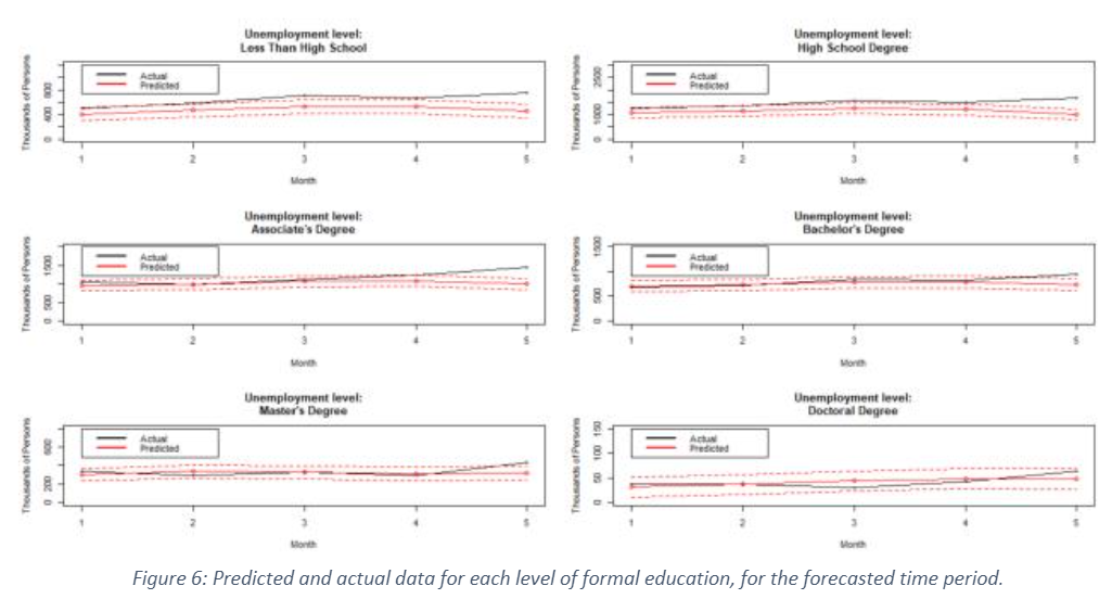
After inspecting Figure 6, the only case where the actual data is within the predicted interval is for doctoral degree holders. Even then, the unemployment level for doctoral degree holders is near the upper limit of the prediction interval. In every other case, there is either a continuous increase, or a sudden jump above the prediction interval for the month of March. Even individuals with an advanced degree saw a change in their employment status that may have occurred because of the global pandemic’s influence within the united states.
Conclusions
Overall, the results were more interesting than surprising. It was interesting to find how the population regardless of education level gets influence in a similar way when you look at the overall patterns in unemployment levels. The simulations allowed us to see beyond the scope of the data available, while forecasting allowed us to see how the latest levels of unemployment differed from what was expected over the past few months.
The simulations and forecasts showed that there should have been a rise in unemployment levels around March, but not quite to the level that was observed. There was also a new low unemployment level expected in May that was seen in all simulated cases except for people with advanced degrees. Part of the reason people with advanced degrees might not have seen that new low level may have been from the amount of variation in the unemployment level within those groups.
In the end, a higher level of formal education does provide some cushion to the changes in unemployment levels that a large portion of the population face. While the population with an associate’s degree or less may experience larger than predicted unemployment levels during these times, individuals with a bachelor’s or master’s degree have seen unemployment levels slightly higher what would have been expected, and individuals with a doctoral degree have not see anything beyond the expected range.