Quality Function Deployment (QFD): Customer Needs, Benchmarking and Development of Interior Package Targets
Background/ Procedure:
An instrument or gauge cluster is a device usually positioned in front of the driver which displays useful information for operating a vehicle. The information usually displayed in an instrument cluster is vehicle speed, remaining fuel/range in addition to any vehicle hazard/safety lights. The first vehicle to incorporate an instrument cluster into its design was the 1976 Aston Martin Lagonda. The instrument cluster would not show up in the US market for another two years when it was added to the 1978 Cadillac Seville. Below is a picture of a traditional analog instrument cluster as well as a more modern digital instrument cluster.

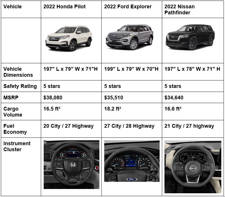
The vehicle segment that has been selected is the 3-row mid-size crossover SUV. The crossover SUV is a combination of a road-going passenger car with features of an off-road vehicle. These vehicles are more family oriented with plenty of space to transport 7 – 8 passengers plus plenty of cargo room. The target customer for this vehicle is a middle-aged adult with multiple kids and a pet. The vehicles which will be compared are the following:
- 2022 Honda Pilot
- 2022 Ford Explorer
- 2022 Nissan Pathfinder
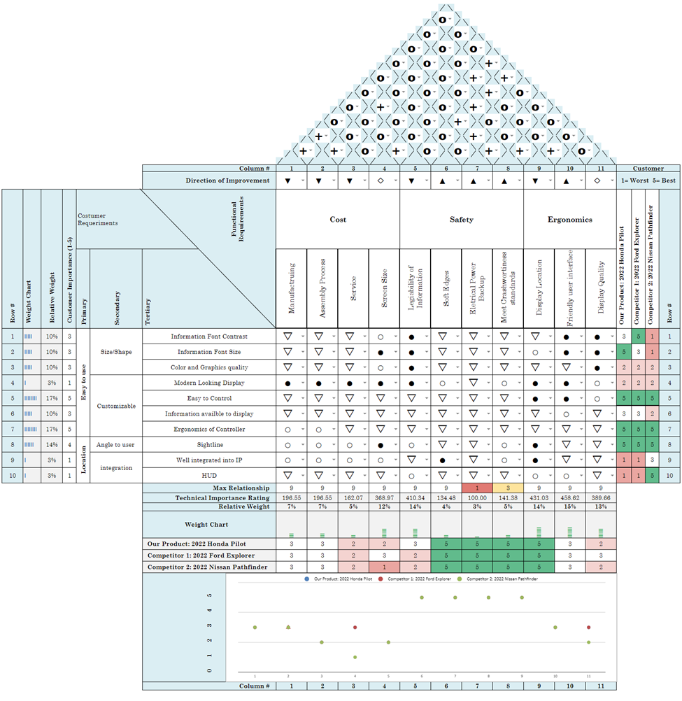
To create the Quality Function Deployment (QFD) chart for the instrument cluster, current customer data was gathered and evaluated. The customer expectations and requirements were then translated into specific engineering/product requirements. Once the QFD chart was set up then the vehicles selected above were evaluated on the QFD chart and scored.
Customer wants:
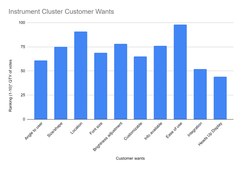
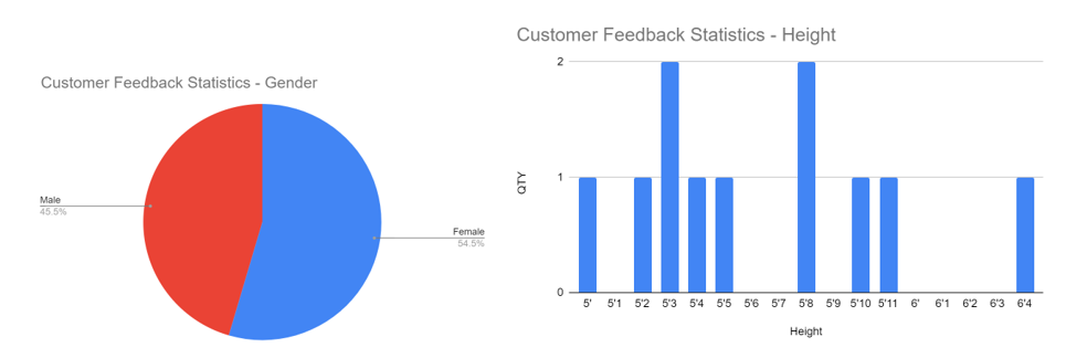
The purpose of this project is to understand customer needs/wants with regard to an instrument cluster. To understand the voice of the customer a survey was conducted and sent out to a total of 11 individuals. Of the 11 respondents 1 drove a full-size SUV, 2 drove cross-over SUVs and the remainder of the participants drove sedans. The results from the survey can be seen below:
Package engineer’s considerations:
The package engineer is the voice of the customer and must balance all the specific requirements of each component that come together in and around the instrument panel (Interior/ Electrical/ HVAC/ Seats/ Steering Wheel). This ensures that when the customer sits in the driver seat and looks around they see a vehicle that is well balanced and tailored for the target customer: mid-aged adult.
Based on the target customer for this vehicle segment, the two biggest priorities for this vehicle should be safety and convenience. This customer will have their kids in the back seat and keeping them safe by reducing distraction is the number one priority for our customer, as a result, the instrument cluster should be within the sight line of the drive to minimize the time that their eyes are not on the road. The instrument cluster should be simple to use, as our average customer already has a lot on their hands and wants a simple and clear user interface. The instrument cluster should be a larger digital display that has all the useful information in one place (current music information/ rear seat reminders/ vehicle condition).
Based on the customer feedback the following engineering criteria were created:
- The driver should not have to look down more than 45 degrees to view the instrument cluster while driving (driver field of view to sight line of instrument cluster)
- The sight line of the instrument cluster should be at least 20mm below the top of the steering wheel, to prevent obstruction from the steering wheel.
- the instrument cluster should be less than 300mm away from the face of the driver.
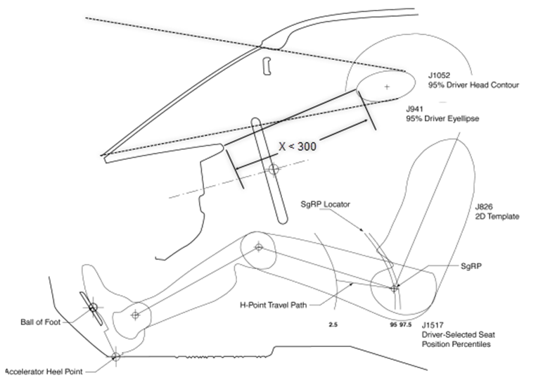
When integrating an instrument cluster into a vehicle there are various key factors that need to be considered:
- Is the instrument cluster obstructed by the steering wheel?
- Is the information on the instrument cluster visible to the driver regardless of the position of the sun?
- How well is the instrument cluster integrated into the rest of the instrument panel?
- Any issue installing the instrument cluster during assembly?
- Does the instrument cluster wiring harness cause any packaging issues with any other component in the instrument panel?
- How easy is the serviceability of the instrument cluster?
- How close is the instrument cluster to the steering wheel?
QFD Chart:
Benchmarking:
Observations and findings:
The customers in the instrument cluster customer survey range in height from 5’ to 6’4”, and are 54.5% female, 45.5% male. The results of the survey show the top priority to the customer is the ease of use. The next highest priority item is the location of the instrument cluster. The third highest priority items were split between brightness adjustment, info available, and size/shape. The customer also prioritizes a digital cluster over analog, customizability (showing only info needed), as well as large font size/proximity to the user. The full list of customer needs gathered from our surveys with their respective weight can be seen at the top of the following page. A five was assigned to the most important customer needs while a one was assigned to the least important. (Top customer needs are highlighted)
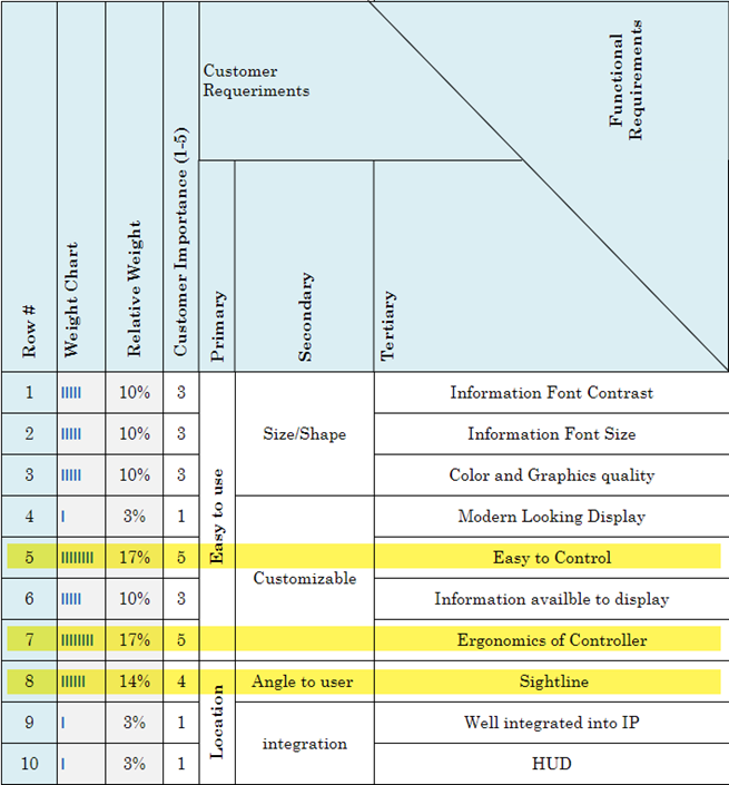
Discussion on findings:
The survey results show the biggest priority to the customer is the overall ease to use. While the customer is driving, they don’t want to have to take their eyes off the road for longer than needed. The best way to prioritize this is by optimizing the screen size/location as well as prioritizing essential information on the cluster. Customizability is an important factor in ease of use, if the customer can modify the screen to show only the items they frequently reference they will spend less time looking at the screen while driving. The customizability will work in the customer’s favor, allowing them to have the maximum amount of information accessible in the cluster. Simplicity in the screen(s) will result in an easier-to-use cluster. An easier-to-use cluster is important when people use a new car they have never driven. Age will also impact customer wants. An older customer will most require a larger font than a younger customer. The customers prefer a digital cluster over analog, this is because of the precision allowed with digital. For example, with an analog cluster, it is much harder to determine the exact speed you are driving, but digital will tell the exact number. Another factor to improve the ease of use for the customer is the sightline, if the customer has to move their head further to look at the cluster they will be taking their eyes off the road for longer.
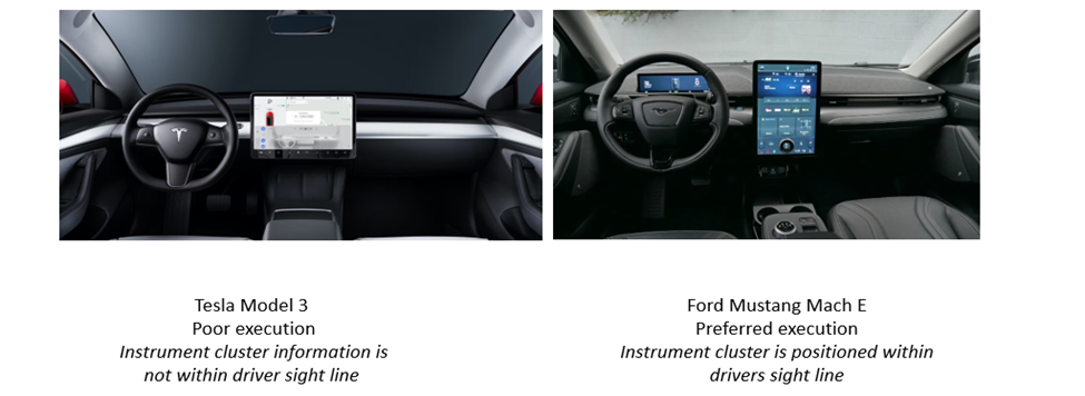
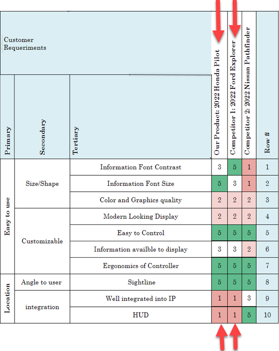
Another comment from the survey was regarding music playing. The customers preferred to be able to see which song is playing on the instrument cluster, rather than having to look at the center screen. This will allow the driver to keep their eyes on the road for longer than if they had to turn their head to change the music. Based on the QFD matrix each of the vehicles was rated to determine how well the instrument cluster meets the needs of the target customer. The results were as follows for the functional requirements, the Ford Explorer ranked the highest of the set. The biggest reason was the size of the screen was bigger and it also seemed to have a higher quality compared to the Honda Pilot and Nissan Pathfinder. As far as customer requirements it was a tie between the Ford Explorer and Honda Pilot. Both vehicles are comparable and equally meet customer needs.

Future Improvements:
After reviewing the customer feedback survey, and benchmarking other vehicles there are some improvements that can be made to our vehicle set. Per the feedback, a digital cluster should be prioritized over analog. A digital instrument cluster would provide a more accurate reading for speed, RPM, and any other information that was previously analog. The digital screen allows the driver to customize the screen to meet their needs. For example, one customer might prefer to see oil temp while another would rather use that screen space for RPM. Each driver could create their own cluster screen(s) and save them for future use. This customizability will also allow customers to preview their music on the screen, versus having to use the center screen to see what music is playing/changing the song. All three vehicles in our set ranked a 3 (out of 5) for information available to display, and this customizability feature would drastically improve this rating for each vehicle.
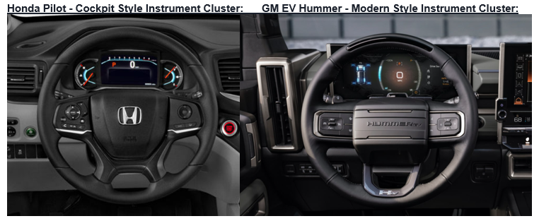
Another improvement would be a modern screen design (see images below), versus the more traditional cockpit design. All three vehicles in our vehicle set have the cockpit design. The modern screen design integrates more smoothly into the rest of the instrument panel. This would improve the functional requirement ratings for all 3 vehicles regarding cost. The new design would be easier to manufacture, assemble, and service, as well as increase screen size. From our QFD, it was determined none of the vehicles in our set ranked highly for a modern-looking display. This design change will increase the screen size, which will result in larger text, without compromising the quantity of information that can be displayed. The clusters need to improve their text contrast, utilizing different fonts and colors. In our QFD, the pathfinder ranked lowest for text contrast, as well as text size. This was followed up by the pilot and explorer. Improvement in text contrast/size will impact visibility, allowing drivers to keep their eyes on the road. Improved text size/contrast would also improve the vehicle’s ranking for the functional requirement of display quality. All 3 vehicles ranked a 3 or below for this requirement. The final improvement is a HUD (heads-up display). In our vehicle set, the Nissan Pathfinder had the HUD feature, while the Ford Explorer and Honda Pilot did not. This was highly requested by the customer and will improve vehicle safety by keeping the customer’s eyes on the road for longer.
Advantages and disadvantages of the QFD approach:
Customer needs cannot always be directly used to design a product since customers are not always fully familiar with any given vehicle system or feature. Customers are also not aware of any new or changing federal requirements and do not take cost into consideration when voicing their wants.
One of the advantages of following the QFD approach is that a QFD helps determine engineering product specifications that are critical to customer satisfaction. As a result, customer needs can be associated with a functional target. These functional targets make it easier for program management to communicate back with each of the engineering teams on what the goals or metrics must be followed to ensure that a well-balanced product is being delivered to the customer. Program teams that take the time to compile and follow the QFD approach tend to build a better product leading to higher customer satisfaction. As a result of all the information which is provided in a single chart a QFD chart is used as a key tool for six sigma (DFSS).
The biggest disadvantage of the QFD approach is that it is very time-consuming. It involves a lot of meetings and discussions for everyone to agree on how to rate and interpret all the information which is gathered by talking with current customers. It also requires benchmarking of competitor products and as a result creating targets to rate your current vehicle to your new vehicle.
Conclusion:
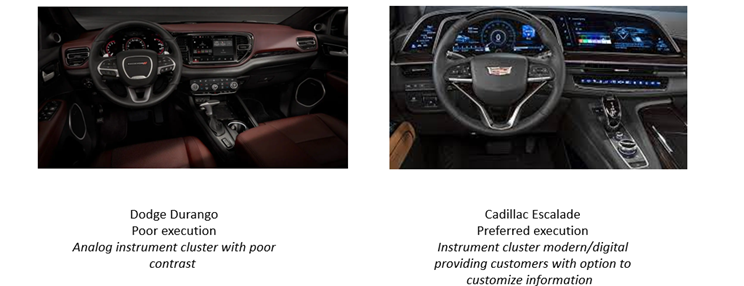
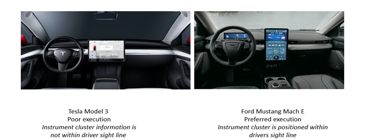
This exercise explored the design considerations of a packaging engineer, looking specifically at the instrument cluster. The team analyzed the instrument cluster design of three similar vehicles, the 2022 Nissan Pathfinder, Honda Pilot, and Ford Explorer. This was done by collecting customer feedback and utilizing the QFD tool to understand the important features and specific requirements that needed to be considered. The top two customer requirements that were taken into consideration were the location, and ease of use. For functional requirements, these segments were cost, safety, and ergonomics. After comparing these requirements to each vehicle, the following areas of improvement were determined for all three vehicles: color/graphics quality, integration into the instrument panel, information available to display, serviceability, and screen size. After reviewing each vehicle’s design, the Ford Explorer ranked the highest for functional requirements, and for customer requirements, the Ford Explorer and Honda Pilot received tied rankings. Instrument clusters should be modern and digital. They should provide customers with the option to customize their cluster based on their needs. The driver should not have to lower his eyes by more than 45 degrees to see the information displayed on the instrument cluster. The instrument cluster should not be more than 300mm from the driver’s eyes to ensure that the information is easy to read. Finally, the steering wheel should not obscure any of the information on the instrument cluster. See below some examples of poor and preferred executions.
Reference:
- “Ad Choices.” Gallery |GMC HUMMER EV | Electric Trucks & SUVs, https://www.gmc.com/electric/hummer-ev/gallery.
- https://www.nissanusa.com/vehicles/crossovers-suvs/pathfinder/features/interior-cargo.html
- https://www.edmunds.com/honda/pilot/
- https://www.caranddriver.com/honda/pilot-2022
- https://www.ford.com/suvs/explorer/

